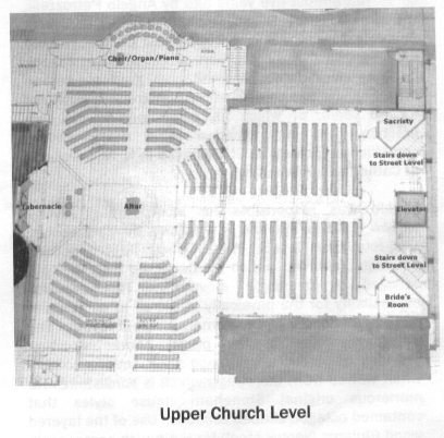
Here's the plan for expanding my parish church in suburban Stoneham: the long rectangle on the left is the current nave, and the square on the right is the addition. The church interior will be reoriented, with the new sanctuary along what is now the left wall.

There are some good things about the design: the tabernacle will be restored to its rightful position on the center axis, whereas it is currently on a side altar. The setting of the organ console and choir in the former sanctuary puts them in an unobtrusive location.
On the downside, the wrap-around seating and the far-forward placement of the altar on its, um, peninsula are a disappointment. The design lacks a visibly distinct and well-defined sanctuary and nave, the classic symbol of divine-human encounter and of earth-to-heaven pilgrimage so suitable for the Holy Mass. The new church will be in some ways a missed opportunity.
Going by a recent parish newsletter, the celebrant's chair will not be on the center axis as this diagram depicts, but will be set to one side. That's a good change.

