Please, please, beam me up.
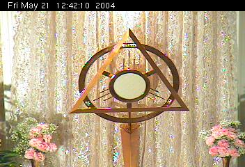
The site (http://www.savior.org/) seems to have a laudable reason for being, by the way.
On another page, this photo appears.
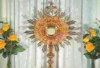
Aaaaah, now isn’t that better?
9 comments
Comments are closed.
Please, please, beam me up.
The site (http://www.savior.org/) seems to have a laudable reason for being, by the way.
On another page, this photo appears.
Aaaaah, now isn’t that better?
Comments are closed.
So what’s wrong with the modern monstrance?
I think a more important question is what is the symbolism there? I would hate to think that the modern one (aside from being disrespectfully ugly) is meant to have some sort of symbolic message that is possibly (IMHO likely) at odds with reverence for the Eucharist.
Hey, anything’s better than what they have at St. Vincent de Paul (Rogers, AR)
They have perpetual adoration and our Lord is left sitting in a glass candy dish.
The top one looks like a standard Trinitarian symbol.
Sorry…maybe I’m missing something…what’s wrong with the first one?
Nothing’s wrong with it, per se, I just found it to be amusing. It’s not to my taste, that’s all.
Come on guys, we don’t like it’s style, but it is a monstrance made of presumably precious medals in a *thoughtful* albeit ugly (imho) artistic design.
Ugly does not equal unfaithful.
Not matter how hard officials from the Vatican on down have tried in the last forty years, it is impossible to keep some Catholics from feeling the most religiously inspired by art of the European Baroque.
Actually, I kind of prefer monstrance #1, with its beautiful and noble simplicity — and, such an innovative, yet true, use of the traditional triangular “God” halo. #2 I find quite overdone, doing its best to distract from the Presence with a great overabundance of glitter…..
karen marie