 |
It’s time to get back to things Catholic like bashing church art since Vatican II. At first I thought to entitle this post “abstract art” in Latin, but upon consulting a Latin dictionary I found there is no word for “abstract.” Abstract art is ars quod nulo sensu percipi notio mente sola concepta or “art removed from the sphere of the senses.” Amazing what Latin tells us about ourselves, isn’t it? Abstract art isn’t entirely removed from the realm of the senses. Such as it is, it obviously presents something to the senses. |
Consider a church that removed a beautiful Crucifix and replaced it with a big, red wall. The Crucifix is a symbol of so many of the treasures of the faith: the mystery of the Incarnation, the price of our redemption, the eternal high priest, the wisdom, power, and humiliy of God. I could go on but you get the point. The big, red wall is a big, red wall. “It’s the blood of Christ, Sal.” No, it’s a big, red wall. And near the big, red wall is a priest who never preaches about the Eucharist. You could say it is anything! It’s a sunset, it’s a sunrise, it’s red, red wine. The point is the meaning isn’t evident. Anyone can say it is about anything. They could even say red is blue or green if they wish.
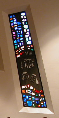
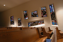
An example are these visages of the Stations of the Cross. Aside from the Roman numerals there is nothing literally symbolic them. Are those the women (all two of them!) of Jerusalem weeping as the head of Jesus passes along the way? I think these stations are wretched. Welcome to that 70’s Parish.


Sal,
That first picture made me dizzy.
Poster – that’s how it looks on the wall! It made me dizzy when I saw it in the church!
Isn’t religious art supposed to express the beauty of spiritual things, not hide it behind minimalist symbols like some gnostic secret?
For one thing, this sort of art has zero catechetical value, so right there you can tell it is contrary to the Catholic ethos.
I don’t often have major objections to more modern Churches, as architecture and ‘tastes’ change over the centuries. They may not be everyone’s ‘cup of tea’, but then there is a lot of variation in older churches, if you really get down and dirty and study the architecture; there are Gothic Churches, etc., not just ‘old’ or ‘traditional’ RC Churches
However, there are basic holy items that need to be in every Church (I suspect that it is Church law):
Crucifix behind the altar—this is the basic symbol of our faith, how can this be removed and replaced with a red wall????
Some symbol by the altar of the Holy Spirit, usually a dove.
Mary statue, and Joseph statue.
Stations of the cross…from your description and the pictures, these seem too minimalist (an understatement) in my line of thinking. The stations you describe and picture tell next to nothing of the story of the suffering and death of Christ.
I don’t think that this Church you are describing is within RCC laws and rubrics, let alone good taste. Where is/was the bishop when this Church was built or remodeled?
I like it better than the 1950’s era church I just inherited. Watch my blog for coming changes. We are replacing two artificial trees with two Statues, and guess what, I have alread received one complaint about it.
I have a nice mission style church, yet the inside looks like Bank of America, circa 1950.
I can’t wait to see the pictures, Father!
They took our lovely church, ripped out all of the stained glass windowa, put up quilts where the windows were, tore out all the pews and plopped an alter in the center and folding chairs all around, not a cross in sight…..sigh
One picture of the inside of our church can be found here.
Like I said, I plan to take out the two artificial trees and replace them with statues.
It’s funny about the plants.
I think alot of churches were built so stark they needed something to make them feel alive. And we chose leafy plants and trees over religious art. Bad idea.
Restore the sacred!
BTW, I was in a nice Byz Cath church this Sunday in eastern PA. If there were any plants I didn’t notice them w/ all the icons and candles and smoke everywhere. As it should be.
In the seminary in the 80’s, we used to opine that the ficus trees were necessary in a church or oratory, propter validitatem. Also necessary was industrial strength carpeting and some bit of natural, unfinished wood – be it the altar, pulpit, chairs or even just the piece of driftwood that vaguely looked like something holy and so could be suspended behind or placed in front of the altar.
“Red, red wine . . . go to my head . . .”
Those windows aren’t even cut level or plumb. It reminds me of that torture room in C.S. Lewis’s That Hideous Strength, where everything is just a little bit off, so that hellish unnatural inhuman surroundings start to feel comfortable after a while.
Cheapest possible construction, no visible tabernacle, no Crucifix; these are the requirements for any new parish.
Hey Fr. Keyes! I love that the Tabernacle is front and center!
Yeah, those trees gotta go. Now if you can just dig up those candles (the ‘real’ kind in the black wrought iron that people light for loved ones) then you’ll really be in business. I miss those… I think most people do.
Thanks for the picture, Father! I think that an antiphonal division would be nice where the ersatz trees are! (I just know that there were pipes behind you when you took the picture …)
Really, not a bad-looking church. Maybe there is some carpet that needs to come up; it is hard to make the floor out (and those hymnals in the pews) — as it should be from the loft! And I am not so sure about Our Lady of Palm Beach’s fronds; although genuine is always good, that statue might be up for relandscaping as well. But all in all, luxurious compared to the incredibly cramped old jail cell (100% painted cinderblock) Carmelite chapel where I attend these days.
Benign neglect can be a wonderful thing!
P.S. I realized that I spent this whole post on Father Keyes’ photo, not on the original photos. Well, there it is in a nutshell!